Tenancy Manager Beta
Creating a tenancy progression platform for estate agents
Rightmove | Tenancy team
August 2021 – October 2022
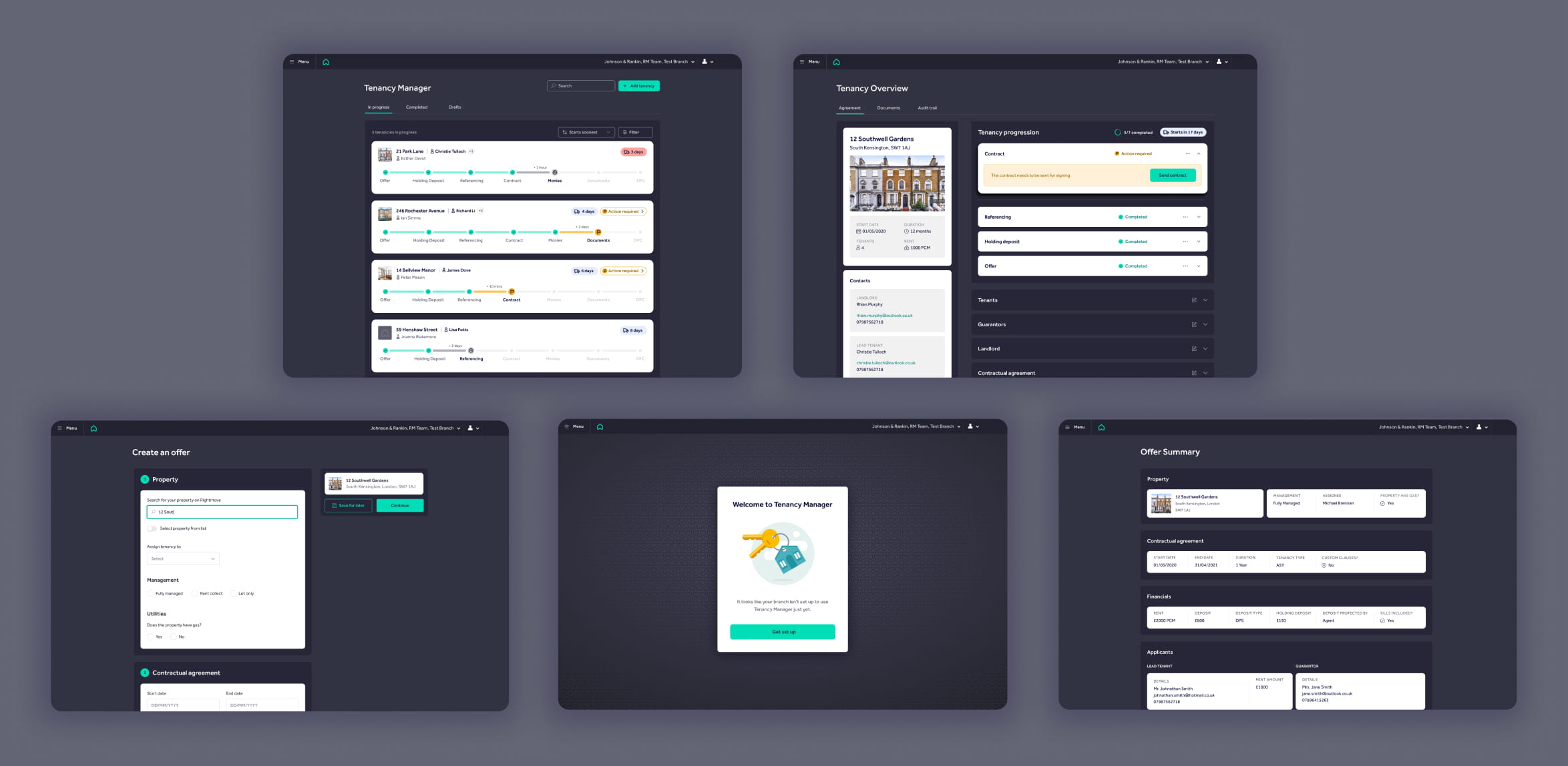
splash
Business goal
User problem
Scale
Role
The problem space
Progressing tenancies is an incredibly manual, frustrating and time consuming process for estate agents. The process involves a lot of email and phone chasing, duplication of data entry, repetitive checking of bank accounts and the need to keep up with current legislation in order to stay compliant. Rightmove’s Tenancy Manager reduces the amount of time that agents spent progressing tenancies to as little as possible.
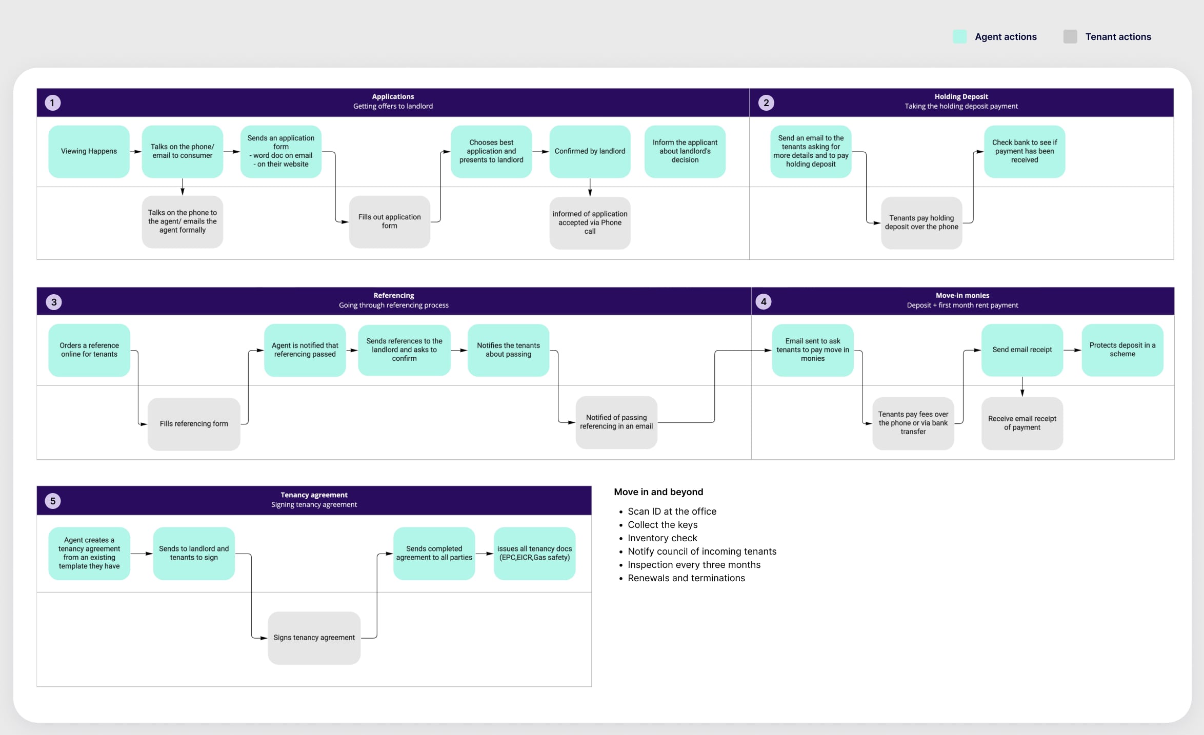
The existing manual flow of progressing tenancies. The admin time amounts to around 45 minutes per tenancy.
The business objective
With the lettings market booming and a plan to diversify revenue streams, Rightmove was incentivised to expand its offering into the rental space. Our OKR was to increase the amount of customers using Rightmove’s referencing service. Therefore, Tenancy Manager beta was to be offered to referencing customers for free whilst we built enough functionality to become a new, chargeable product.
Understanding the user
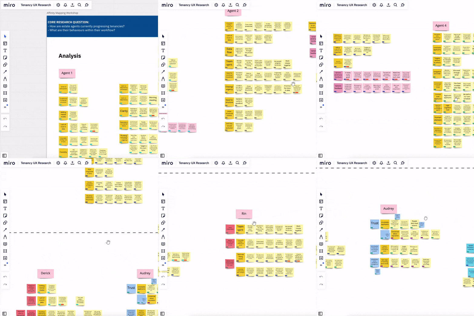
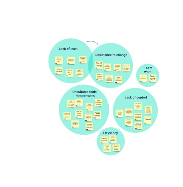
I began the project by doing discovery research into how letting agents worked. I wanted to understand their values, needs, limitations and how they worked together as a team. I conducted interviews with eight different agents in various roles (directors and negotiators) from various company sizes (from single branch to multi-branch). I ran an affinity mapping workshop with my team to analyse the findings, grouping insights and key quotes into themes. These themes became the anchor points for design decisions later on.
GIF
Affinity
The proposed flow
The flow for Tenancy Manager was already defined by our Lead User Experience Designer before I joined the project. It was my role to work with my Product Owner and Lead Engineer to separate out functionality possible for beta, V1 and V2. The diagram below shows the flow for the beta version where scope is limited to stages of tenancy progression prior to the tenant moving in.
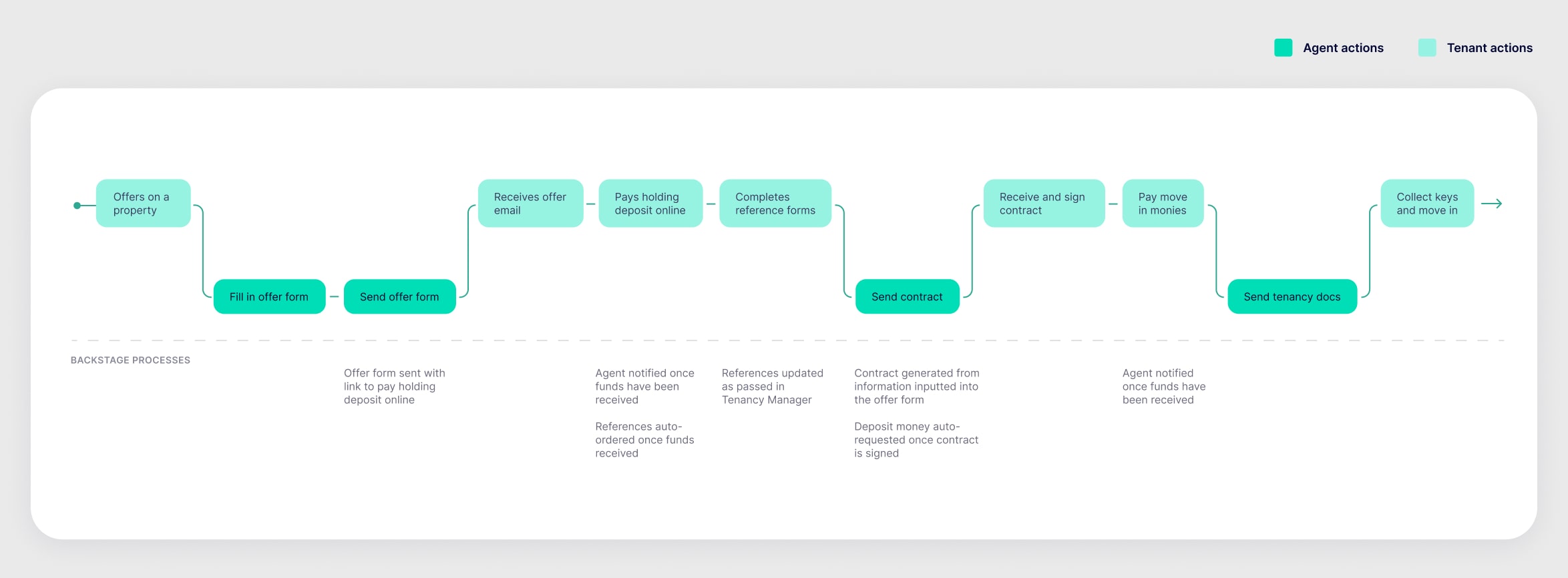
To make the above flow possible and taking into consideration they key themes that came out of affinity mapping – as a team we decided that we needed the following pages:
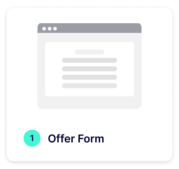
Offer form
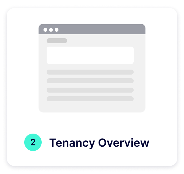
Tenancy overview
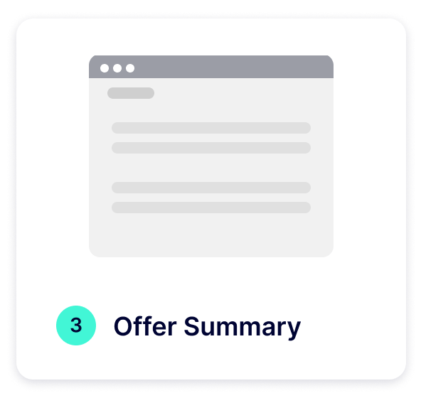
Summary
Dashboard
In the spirit of (trying!) to be succinct, I’m going to focus on the design of the dashboard in detail for the rest of this case study.
Design approach
I decided to use an activity based design approach as I wanted to leverage usability and task success over engagement. In practice this meant that I focussed on providing clear progressive disclosure and stripped the interface of any elements that didn’t support fulfilling the goal. During discovery research we found that a “lack of control” was a sentiment felt by most agents. We hoped that providing visibility of all tenancies in progression via a dashboard would help remedy this feeling.
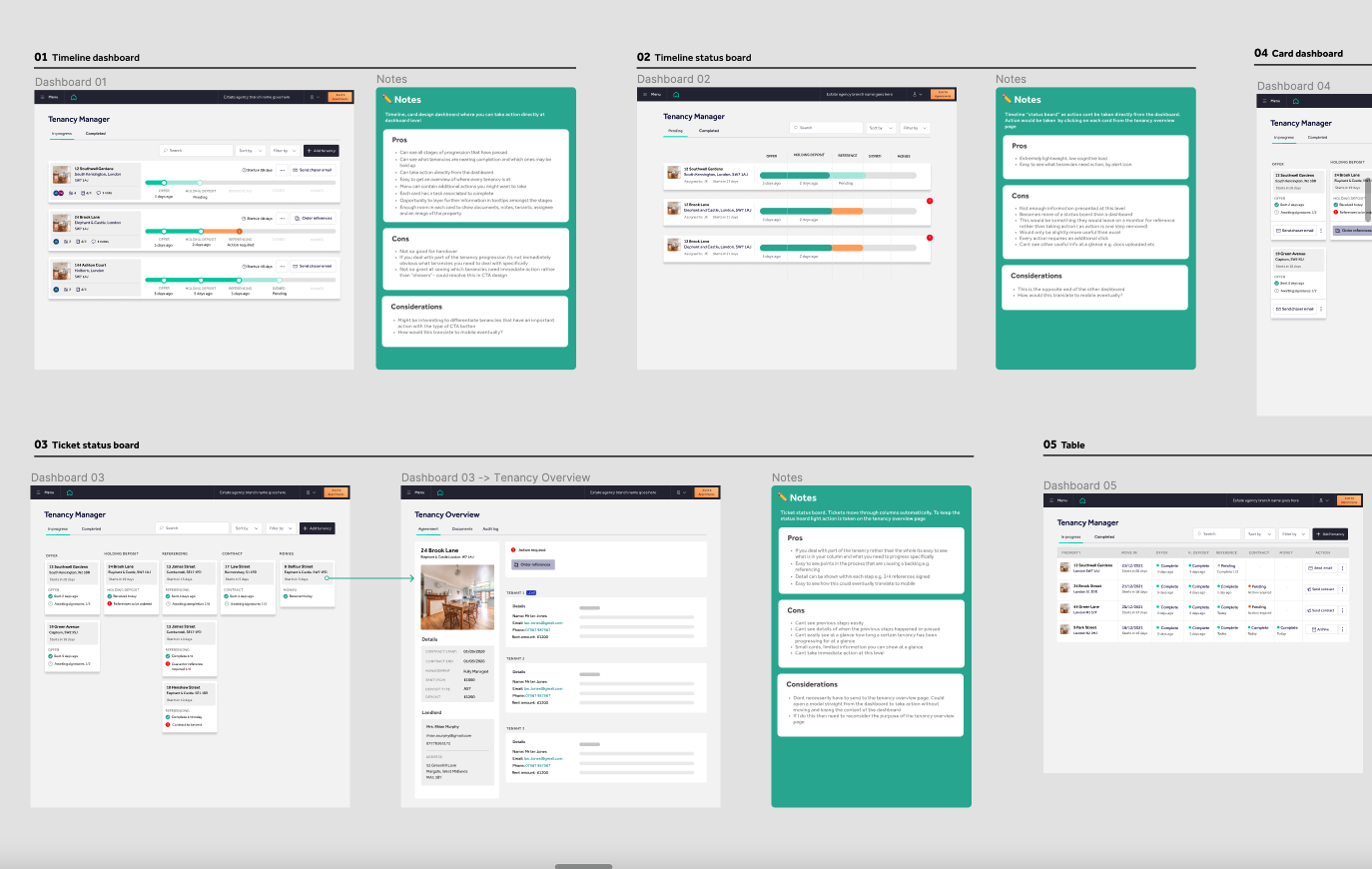
Initial concepts for the dashboard
Shortlisted concepts
I presented concepts back to my squad and wider design team and they dot voted on their preferred concepts. The two concepts that were chosen were the timeline and the ticket status (kanban) board. I showed both concepts to four different estate agencies of varying characteristics to understand how, when, why and what they would use each dashboard concept for.
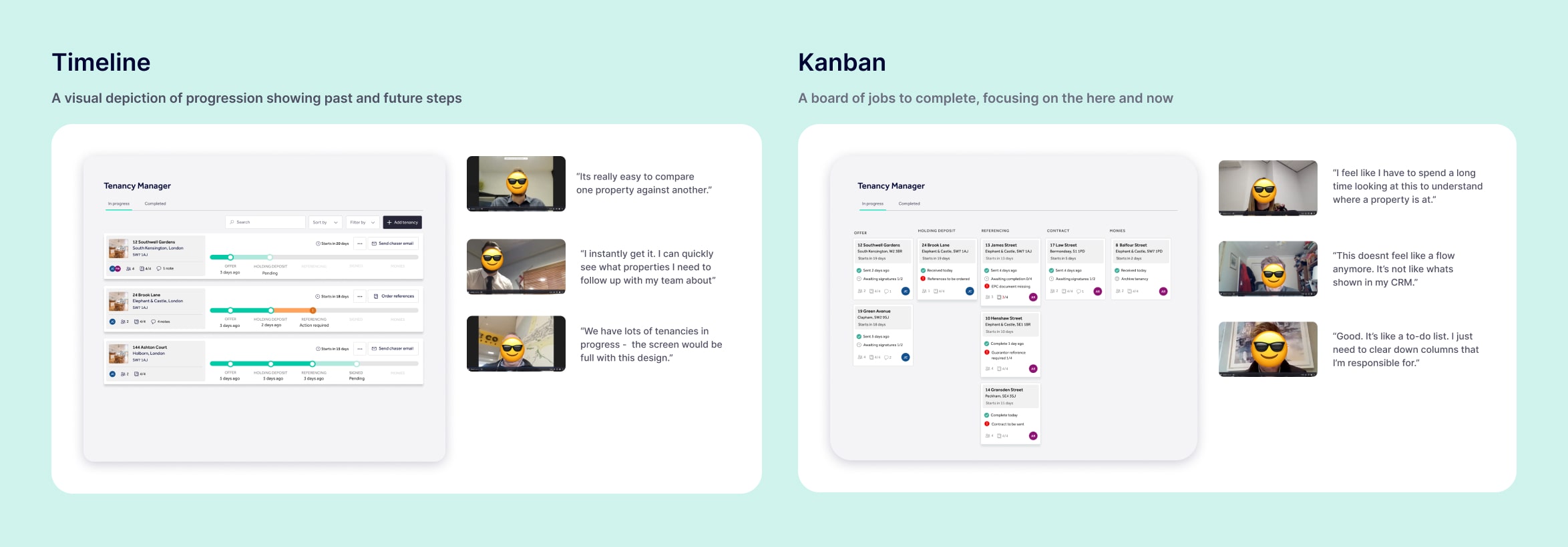
Letting agent’s feedback on the chosen concepts
The timeline concept had a positive gut reaction amongst the majority of agents as the simple visual design depicted the linear flow that they’re familiar with. Two agents that we spoke to felt that the kanban concept could help them to manage their time more effectively, as they could clear down columns of the same task. I felt that there was more in the kanban concept to be explored.
Exploring kanban
I timeboxed three days to push the kanban concept. I explored various themes for column headers and what how this would affect agents workflow. Themes included splitting the columns by tenancy progression stage, time taken to complete tasks and by the type of action they’re undertaking.
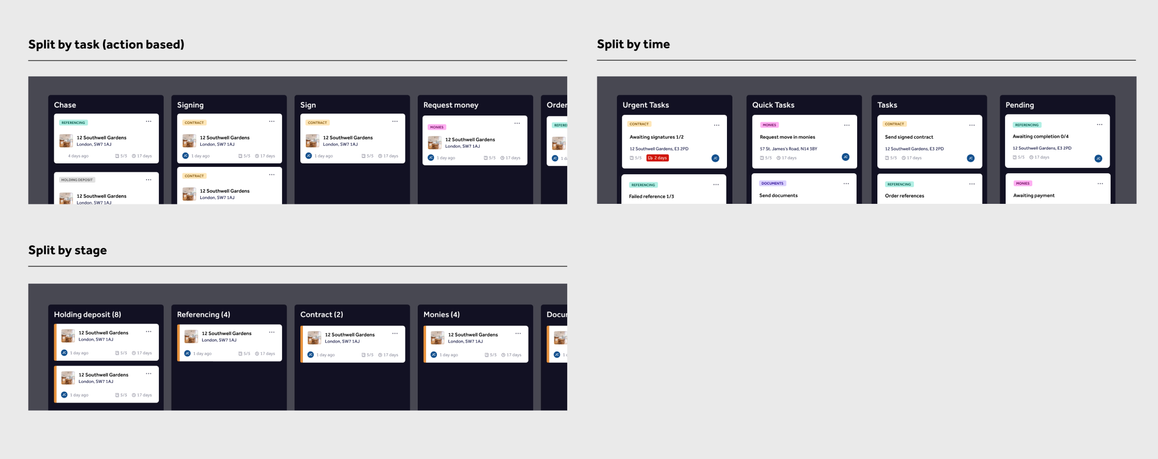
The more time I spent pushing the kanban concept, the more it started to become apparent that it was solving a different need to the timeline concept. The “split by time” kanban concept assumed agents managed their tasks strategically based on the time they had available whereas the timeline concept assumed agents worked down a list of properties – regardless of the task involved. To answer what dashboard would best fit their workflow, I wanted to take a step back and look into how exactly agents planned their daily tasks.
A day in the life discovery research
I ran more sessions with agents asking them to take me through their typical workday and asked a series of questions to understand how they prioritised their daily tasks. This was a granular level we had not been to so far during research, as most of our focus had been on understanding the overall tenancy progression flow.
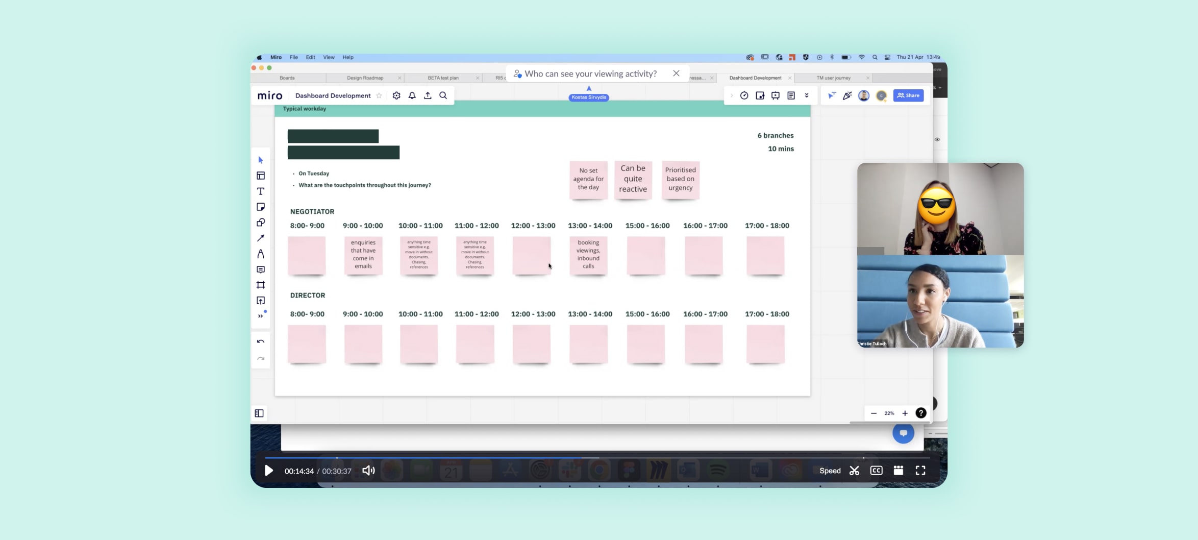
Leading “day in the life workshops” with agents
Key findings
- Agents prioritise their work based on the urgency of the tenancy
- They’re experienced and know what they have to do each day
- Tenancy progression is the least important part of their day as it has no monetary value
- They have to be reactive so there is no set pattern to their day
- They’re extremely time poor, so they multi-task
Agents weren’t strategically planning their tasks, they were working down a list of tenancies from most to least urgent. As tenancy progression had little monetary value compared to time spent chasing new leads, there was no appetite for adopting a new way of working. They needed tenancy progression to tick away in the background with as little involvement or cognitive load as possible. They needed the timeline concept. I took these key findings and used them within its development.
Developing the UI
The findings from the day in the life workshops helped create questions that I needed to answer for the user when scanning each timeline card. Some examples include “is this urgent,” “who is involved” and “what do I have to do.” I used grey-boxing to then give hierarchy to each of these questions and applied it to the design of the cards. This made sure that the visual hierarchy matched a prioritised list of user needs.

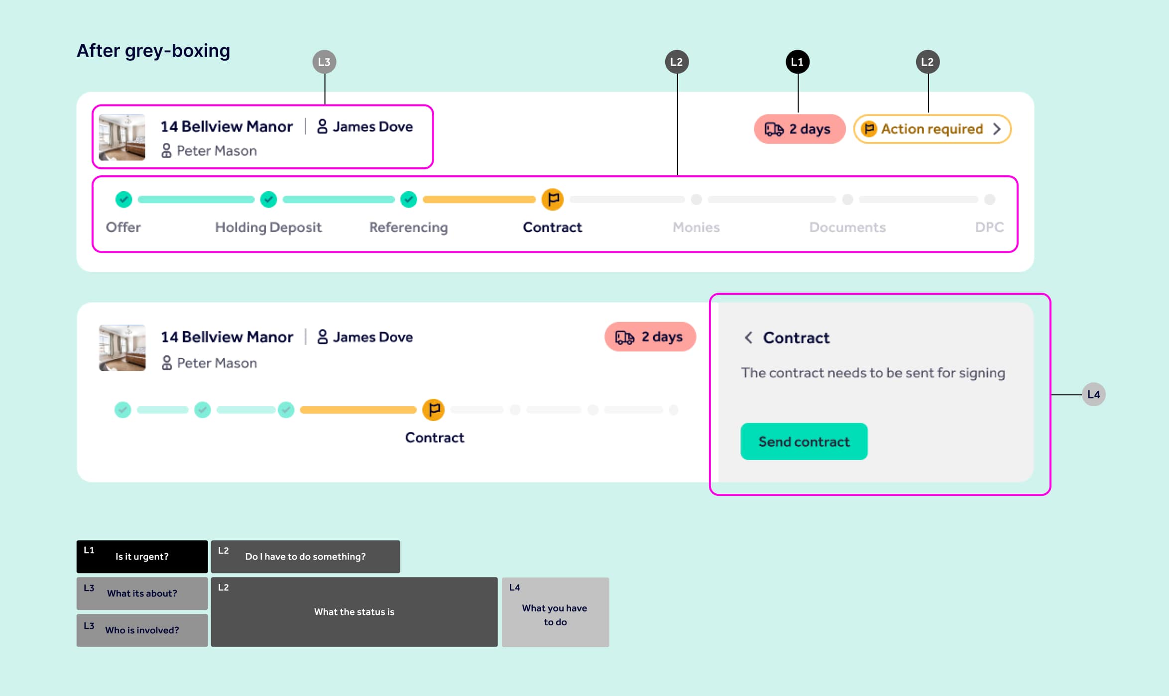
I explored micro interactions within the card, from the way the user could take action to hover effects showing dates on the completed stages. Once I was happy with the design of the cards, I usability tested the dashboard with six letting agents, gathered feedback and iterated on the design.
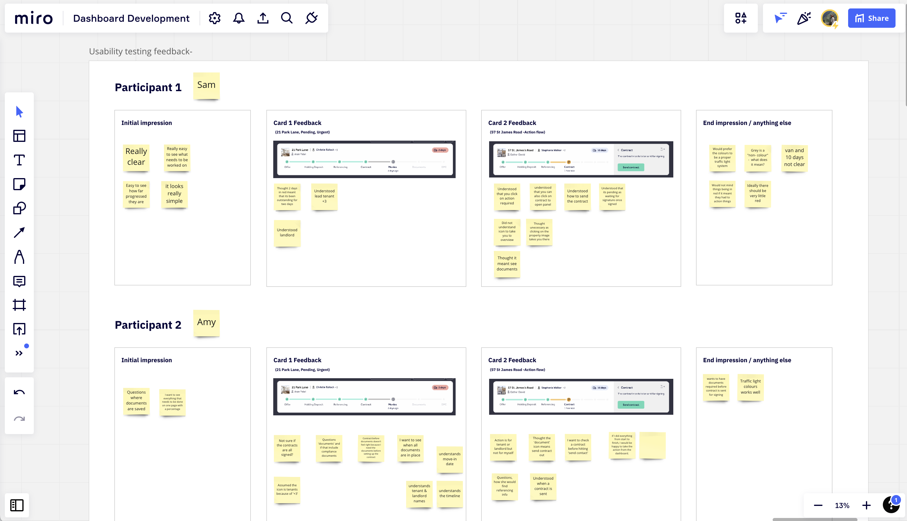
Notes from dashboard usability sessions ran with agents
Unique components
As I was creating a new tool unlike anything else within Rightmove, I had to work outside of our design system and create new components where necessary. Working closely with the front-end engineers we made sure everything new that we created was accessible to WCAG AA standard. One of my favourite parts of seeing the build of the dashboard come together was designing relevant animations for the timeline to delight our users when they completed steps.
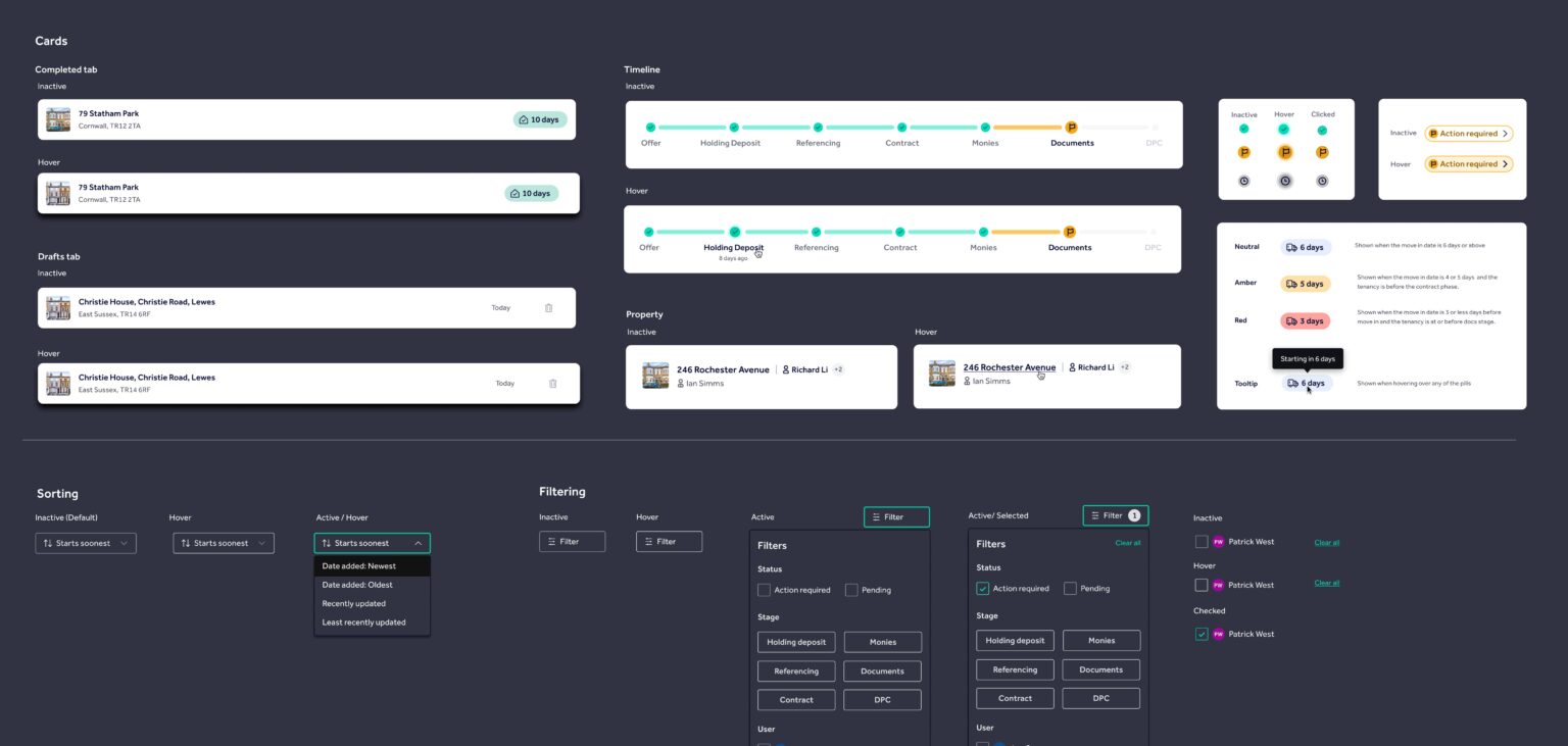
12 new components were created for the dashboard
Dashboard final design
Below is the final design for the dashboard in Tenancy Manager. The process that I went through documented in this case study took around two months before handing assets over to engineers to build.
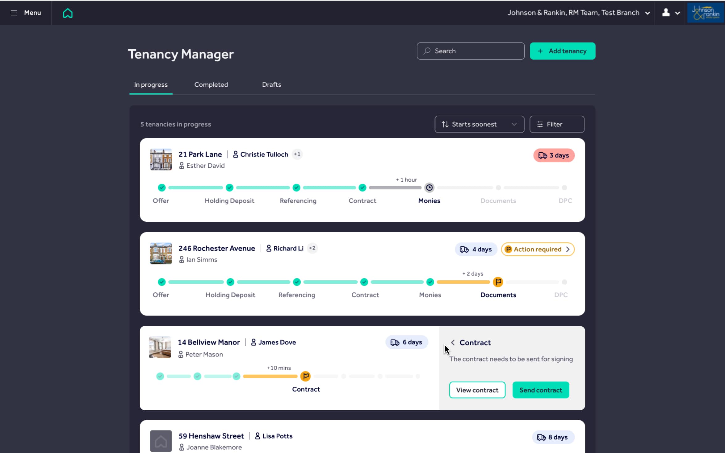
Final design for the dashboard
Short walkthrough showing all of the pages I designed for Tenancy Manager beta
Release of the beta
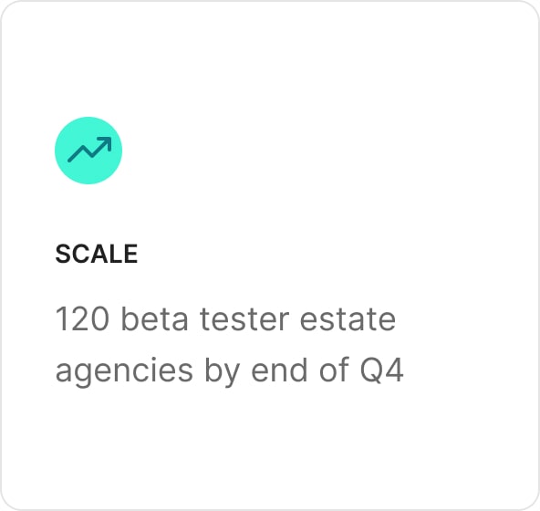
We released Tenancy Manager on 31st May 2022 to six estate agencies. As of October 2022, we are live to 30 branches and have surpassed 100 tenancies created in Tenancy Manager during a single month. We have facilitated over £100K in deposit payments to estate agents through Tenancy Manager. To date, we are working on key functionality needed in order to become a proper, chargeable product – at which point there are plans to scale more rapidly with the help of the wider sales team.
Ethnographic research
Prior to launch, I set about planning how and when we were going to collect feedback on how the beta was performing. We set up GA tracking events and Hotjar on key pages. We found that our beta-tester agents were incredibly forthcoming in terms of relaying feedback and were happy to set up video calls to give us more context into any issues. However, I found that there was only so much you could understand about the product via video call, so I arranged to visit three of our beta agencies in person.
During the day spent with estate agents, we did three different activities:
- 2 hours of shadowing
(Sitting quietly in their office and observing the environment in which they use Tenancy Manager.) - Guided walkthrough
(Asking them to complete specific actions in Tenancy Manager while they talk through the task.) - Journey mapping
(Consolidating their process on paper, detailing how Tenancy Manager fits into this and highlighting any potential gaps.)
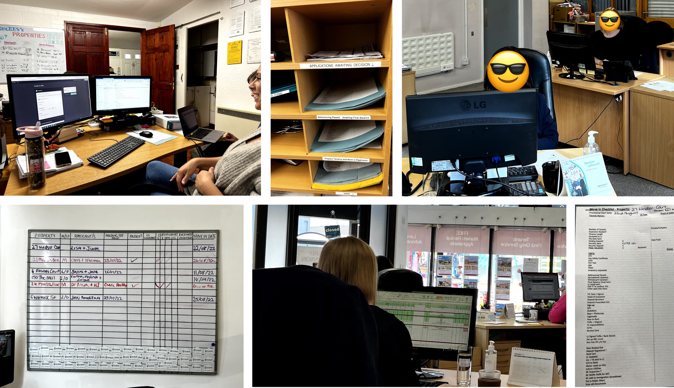
Photos taken during our ethnographic research visits. The top left is a letting agent using Tenancy Manager!
This is all of my work on to date on Tenancy Manager as of October 2022.
Key learnings
- The importance of exploring ideas that you feel could be pushed further – even if they don’t end up as your chosen concept. Although we didn’t go with the kanban dashboard concept, our learnings from the additional research we did as a result developed the timeline concept in a way that we may not have investigated otherwise.
- Building relationships with users is important for getting detailed feedback, especially within the B2B space. At the start of the project, we found it difficult to incentivise agents to talk to us. After a lot of time and energy we built up a network of users that we could call, email or visit whenever we needed.
- Having a good relationship with your Product Owner is fundamental to producing a successful outcome. I was lucky enough to be given enough space to fully explore the dashboard. The result was that we delivered something that as a team we are all immensely proud of and that completely fits our users needs.
