Arbor Education
Redesigning navigation across enterprise software
Arbor Education | FE team
May 2020 – September 2021
splash
Problem
Audience
Role
Tasks
Arbor is a management information system (MIS) used by over 1,600 schools with 300,000+ users. It’s enterprise software that streamlines school processes, from teachers taking school attendance and issuing detentions to parents paying for school trips. I joined Arbor as the only designer in a 130+ employee base as part of the front-end team.
The problem
Product teams consisting of a product manager and BE developers built new workflows using an existing design system. With no designers or UX processes in place, there was no oversight of the entire platform UX and UX within different modules of Arbor became siloed. Navigation across the system is where this issue was most apparent. Nobody had been the sole owner of navigation, so product managers had spent years adding pages into the navigation in an unregulated manner. Because of this, navigation had become a monumental mess.
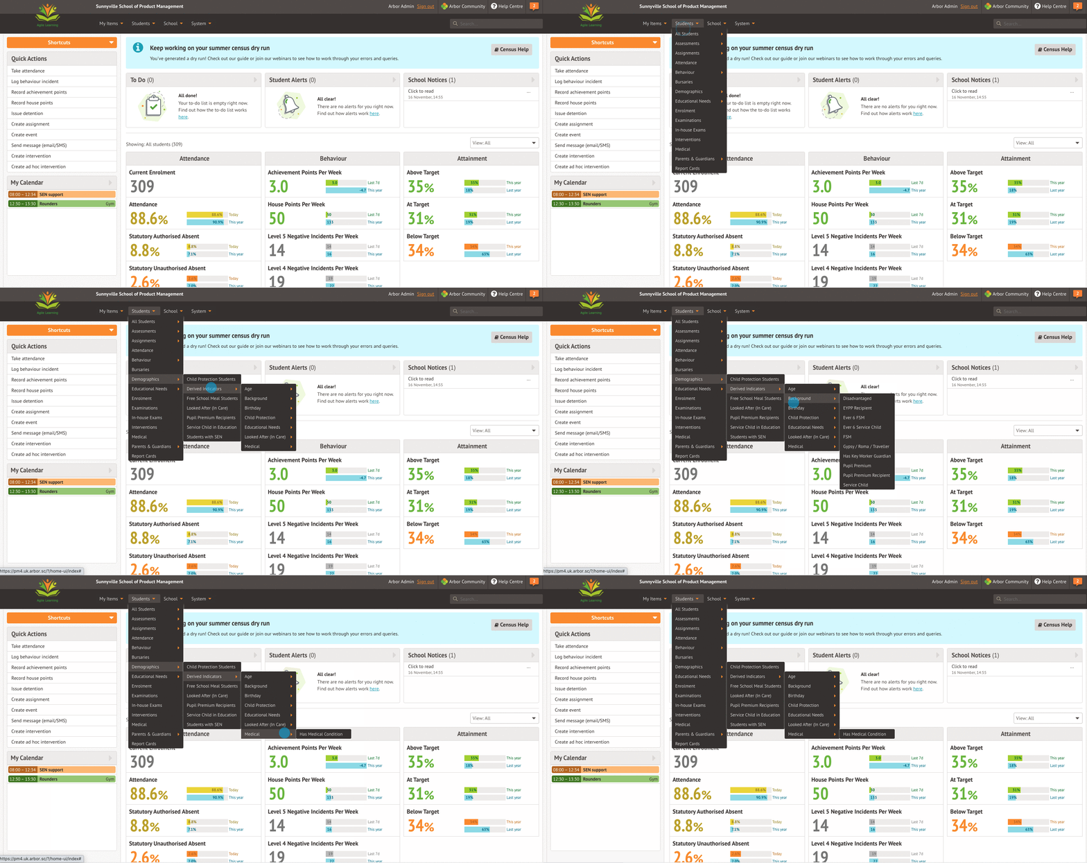
The scale of the problem – multiple nested dropdowns, page duplications and using navigation as a filter
Understanding the problem
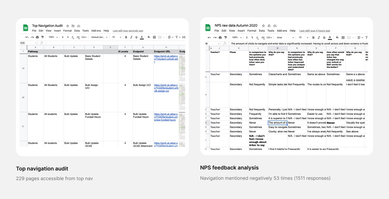
To appreciate the scale of the problem, I audited the current top navigation and found that there were 229 endpoints from the top nav – an excessively large amount. To understand whether our users found this a problem, I scoured through NPS feedback and found that issues relating to poor navigation were specifically mentioned 53 times, outweighing positive navigation commentary by ten times.
During the understanding phase, I spent time talking to and surveying a variety of users (teachers, school leaders and admin staff) about their experience navigating in Arbor. I ran usability tests with new and existing users to generate baselines and understand more about how they navigate around Arbor.
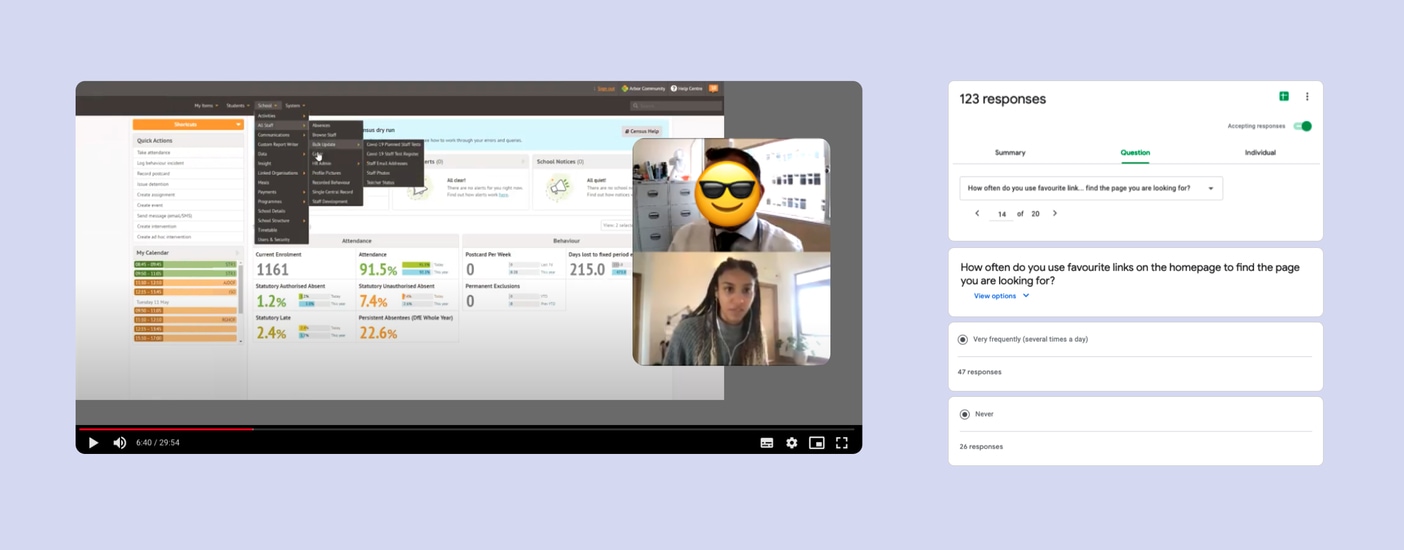
Usability testing navigation and surveying users to understand more about their experience navigating
Key findings
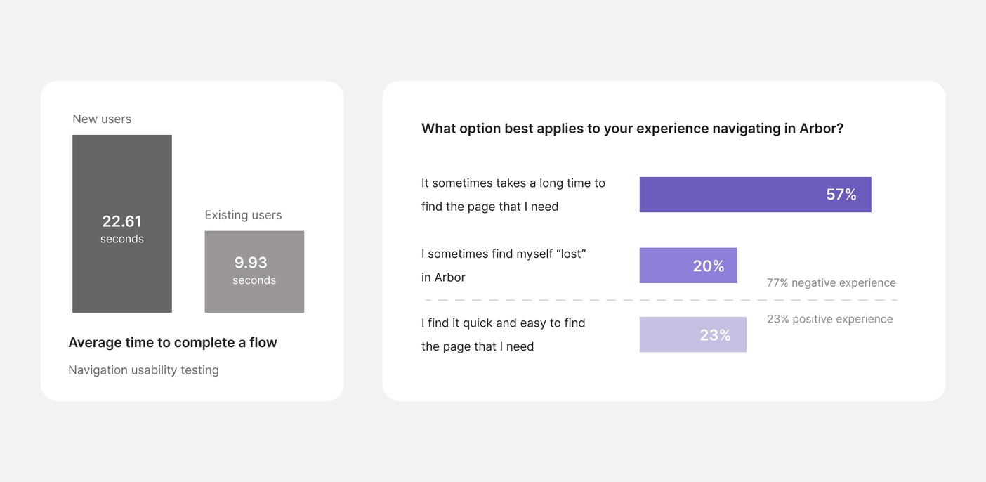
Survey results showed that the majority of our users (77%) have a negative experience navigating in Arbor, with only 23% of users finding it quick and easy to find the page that they needed. Usability testing showed that new users took more than double the amount of time to find the pages asked of them during the test. Most opened and closed every dropdown and found pages through trial and error.
Design principles
I created design principles in order to anchor all design decisions I made during the concept generation stage to the findings from my research.
- Improve learnability
I wanted to eliminate the trial and error mentality users took when trying to learn how to navigate around Arbor. I wanted to improve learnability by making navigation simpler and more intuitive.
- Aid discoverability
I wanted to break down user hesitancy to explore and encourage both new and existing users to utilise areas of the MIS they’re unfamiliar with.
- Champion orientation
When a user lands on a page, I wanted to make sure that they are aware of how they got there and where they could go from here through use of clear signposting and page CTA’s.
These principles fed into my overall goal to:
- Reduce users time spent navigating
Concept generation
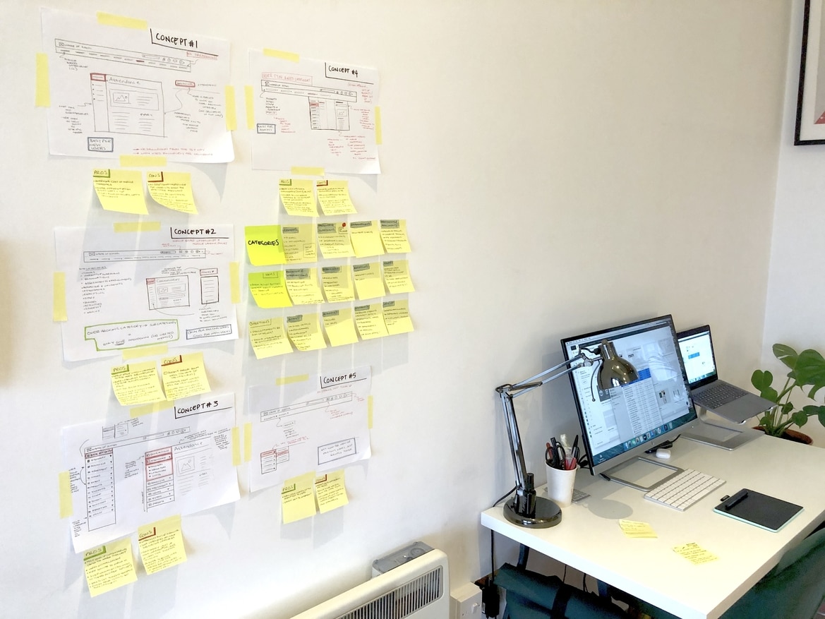
I created five different concepts to improve navigation and hit my three design principles. To narrow down these concepts and gather feedback, I ran a workshop with the rest of my front-end team. We voted on our favourite concepts and narrowed five concepts down to two.
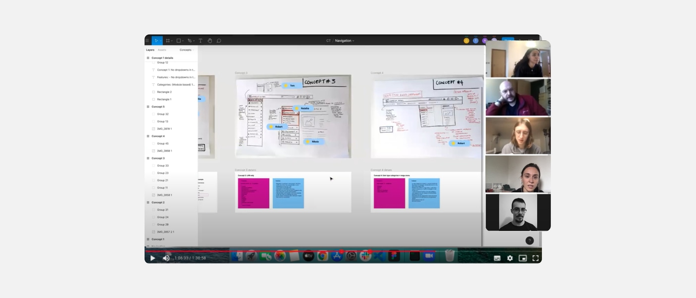
Workshop I ran with my front-end team where we voted on our favourite concepts and shared feedback
Shortlisted concepts
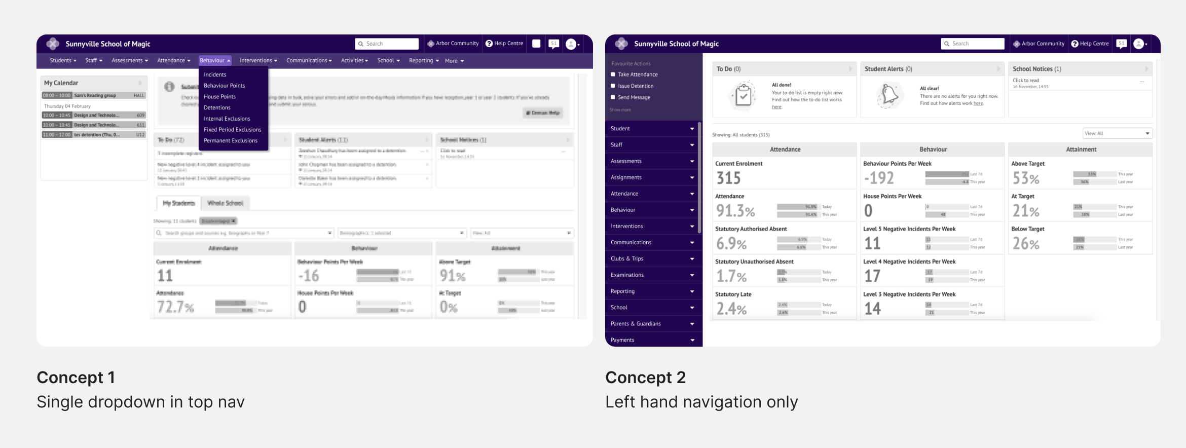
Two concepts that were chosen during the workshop with my front-end team
The shortlisted concepts included an option that kept the process of navigation similar to the original version, but expanded the list of primary categories (concept 1). The other shortlisted concept (concept 2) removed top navigation altogether and kept all navigation within a left-hand panel. I shared both concepts with users to get their feedback and a preferred option.
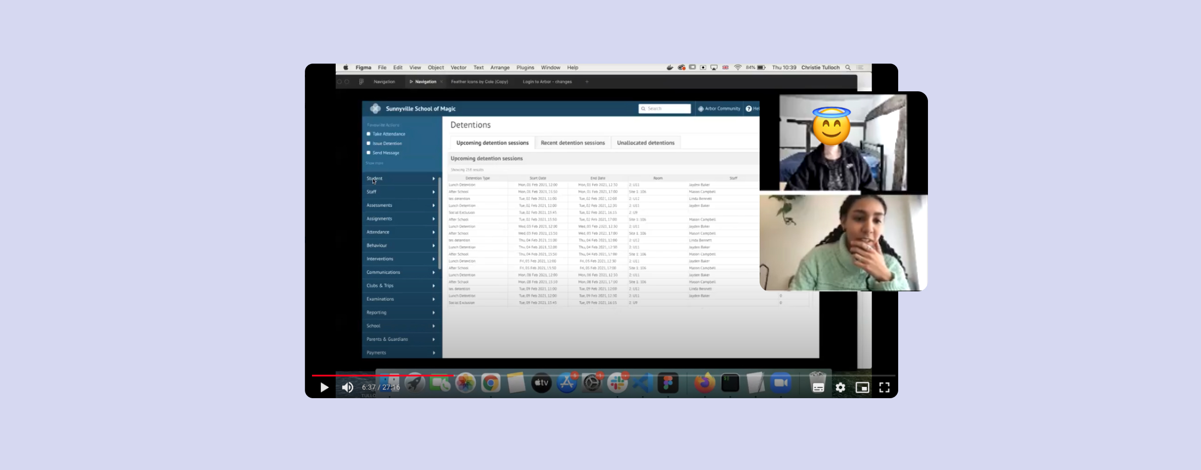
Sharing the two concepts with users to get feedback and a preferred option
Chosen concept
I also presented both concepts to senior management and team leaders across Arbor in order to make a decision on what concept to develop and to get buy in from the rest of the company. Users and stakeholders at Arbor all unanimously chose the concept below (concept 2) as the concept to develop into a final design.
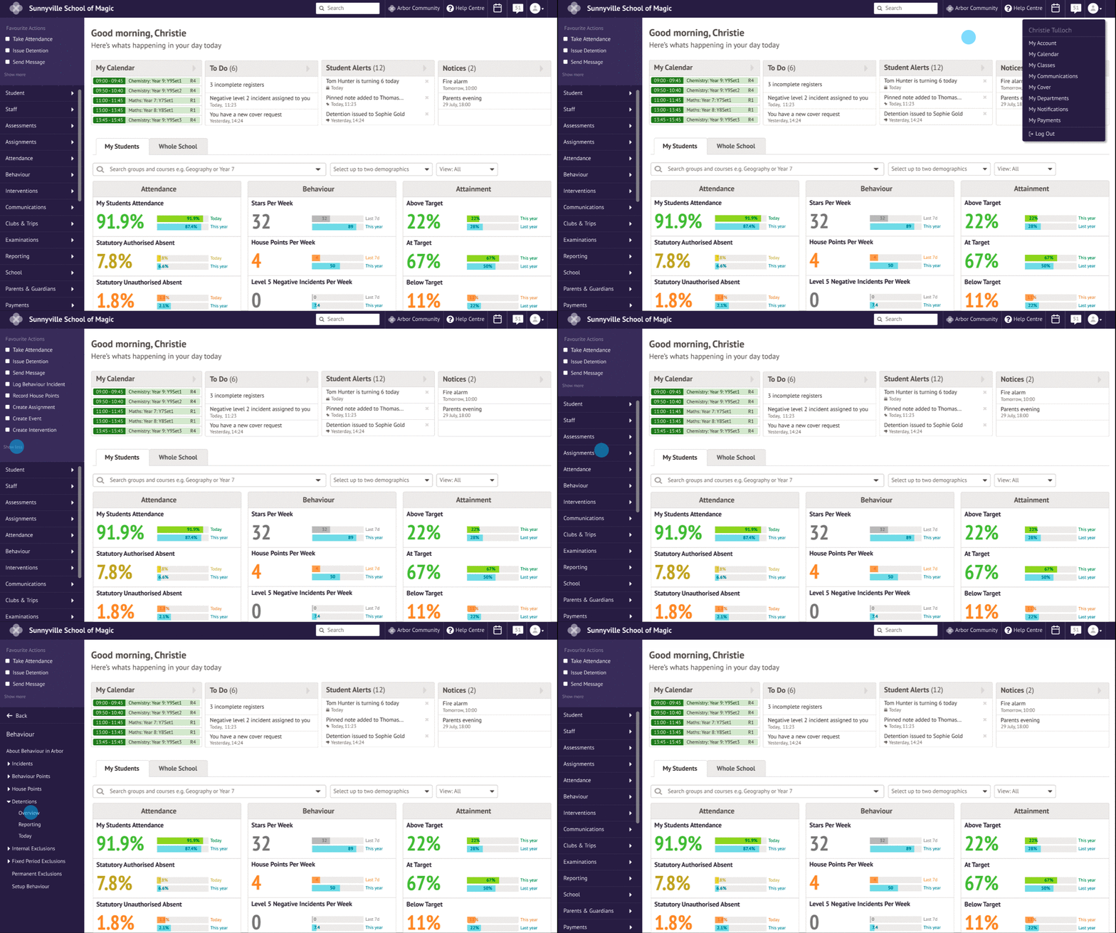
Concept features
- Primary categories created from Arbor modules
- Global favourite actions
- Universal design for all devices
- Less mouse movement to get to the page you need
- Reduced amount of page loads required to get to the page you need
- Reduced application chrome and maximises page space
- Future proof – there’s endless vertical space to add more primary categories
Defining the information architecture
During the concept generation phase, I decided that the primary categories of the navigation should be modules within Arbor. In order to define the IA within each of these modules, I worked with each module product manager to group any standalone pages and define subcategories in an effort to streamline each module.
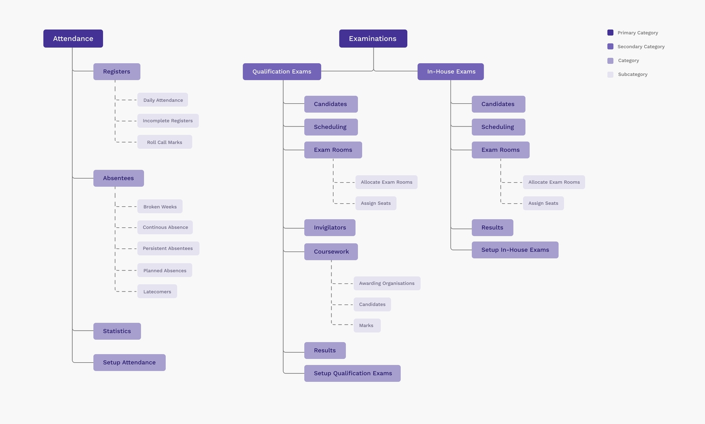
IA tree showing the vertical navigation through the attendance and examinations primary categories
Developing the UI
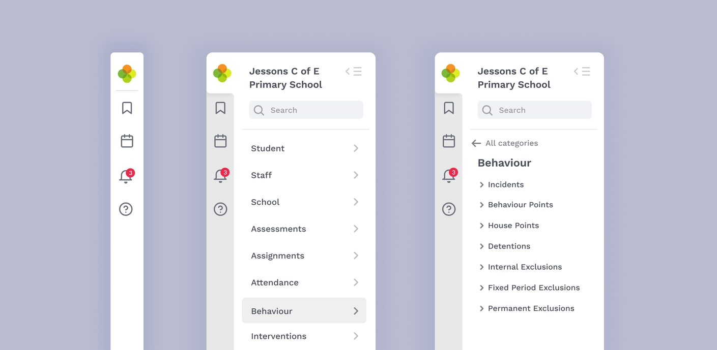
To maximise the page space, I decided to remove the top bar and group all previous top bar widgets into the side panel of the left-hand navigation. Users searching for student profiles using the search bar is the top workflow within Arbor. Because of this, I made sure that search was still accessible within one click, so featured it prominently at the top of the panel. Users expressed a desire to customise their navigation, so I explored allowing users to edit their theme based on their school colours at a system level.
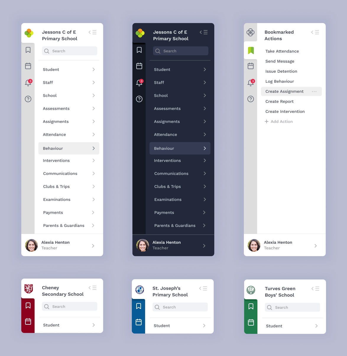
UI themes – light, dark and customisable based on school colours
This was my work to date as of August 2021 on this project, shortly after this I moved to another company. If I were to continue on this project, these would be my next steps:
- Finish defining the IA across all of the modules within Arbor
- Explore accessible UI colour themes for colour blindness
- Sense check all terminology used within the navigation with users
- Build a prototype of the new UI and usability test the new navigation
- Release a beta version of the new navigation to a select group of users
Key learnings
- How to present ideas and research to get buy in from the wider company. Changing navigation affects all teams – especially the support team! Getting buy in from them on this project was crucial in order to get the project go ahead.
- Don’t underestimate the time good UX and research takes. This project has taught me a lot about patience and diligence. Unpicking an IA mess of this size as a solo designer doesn’t happen overnight.
- The importance of sharing ideas early on. During the concept phase I shared my ideas with my team whilst they were still basic (ugly) sketches on my wall. Getting their technical knowledge helped me iterate quickly and leave behind ideas that weren’t feasible.
